Bonjour tout le monde !
Bienvenue dans WordPress. Ceci est votre premier article. Modifiez-le ou supprimez-le, puis lancez-vous !
Magee Shortcode Guide
Magee Shortcode Guide
Free Version Installation
Method 1. Install using the dashboard.
- In your dashboard, go to Plugins, click on Add new, search Magee Shortcode, the first one By MageeWP that's it.
- When the Magee Shortcode appears, click Install button, then the WordPress will start downloading the plugin.
- Active the plugin
Method 2. Download from WordPress.Org
- Download the installation file magee-shortcodes.zip from the https://wordpress.org/plugins/magee-shortcodes/
- Go to Plugins in the Dashboard
- Click on the Add Plugins button
- Click on the Upload Plugin link
- Select the magee-shortcodes.zip file
- Click Install Now
- Hit the Active to active the plugin after it is successfully uploaded
Pro Version Installation (*Pro version not available yet)
When you want using pro version, you need purchase it, download the pro theme file in our website. Then follow these steps below
- Go to Plugins in the Dashboard
- Click on the Add Plugins button
- Click on the Upload Plugin link
- Select the magee-shortcodes.zip file
- Click Install Now
- Hit the Active to active the plugin after it is successfully uploaded
Usage
After active magee shortcode plugin, when you add a new post or page, you will find the plugin here.

Click the Magee Shortcodes button, you will see the shortcodes list.

Click the shortcode function you want, every shortcode has its own function option, just read the function description and use it.
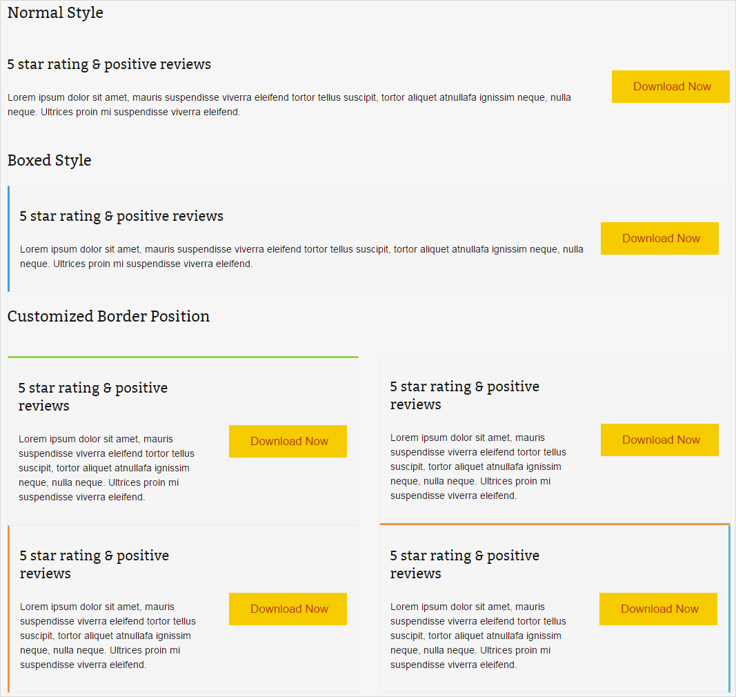
Accordions Shortcode
Accordion is extremely useful for organizing and displaying large amounts of content without cluttering the page, and make it easy for the user to find what they’re looking for.Insert text, images, shortcodes, or anything you want. Accordions are very customizable, and can be as simple or complex as you’d like them to be. You can also make certain ones automatically be open like this one. You can either run them in accordion mode (only one open element) or in toggle mode (multiple open elmenets). It has 2 styles and 2 types as follows.
2 Styles: Simple and Boxed
There are two styles in the shortcode: simple and boxed. The “simple” doesn’t have a border in the whole accordion, and the “boxed” has.

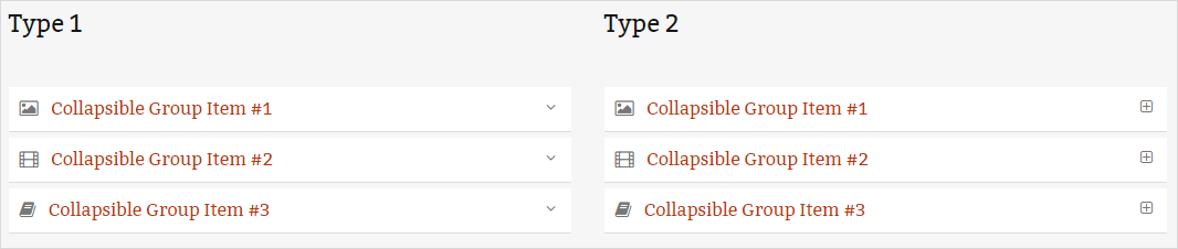
2 Types: Type 1 and Type 2
There are two types in the accordion: “1” and “2”. The differance is in the right of accordion, “1” is a down arrow, and the “2” is a plus in a box.
Buttons Shortcode
A big part of any website, especially those that are selling a product or service, is the style of buttons used in your call to actions and marketing materials. Buttons are an integral part of your site, and we’ve made sure you have the options you need to add beautiful buttons to any page. Choose from 4 sizes, 3 shapes, flat or 3D style, unlimited colors, border widths, icons, dividers and animations as well as buttons that open modal popups.You can easily insert buttons in your site – page/post editor, section content,sidebars,etc.
Unlimited Colors
You could set unlimited colors for the button background and text.
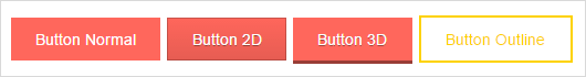
4 Button Styles
Magee button has 4 button styles you could choose: Button Normal, Button 2D, Button 3D, Button Outline.
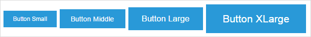
4 Button Sizes
Small, Middle, Large and XLarge, you could use the four sizes depending on your needs.
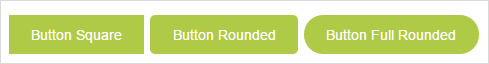
3 Button Shapes
Square Button, Rounded Button, Full Rounded Button. You could choose which you like.
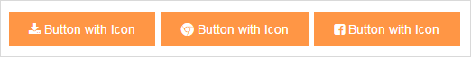
Button With Icon
Magee Shortcode integrates a lot of font awesome icon with buttons. Many social and famous icon you could find in it.
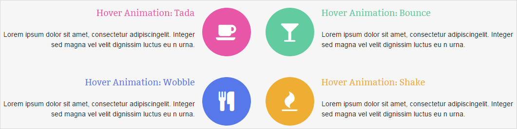
Button With Animated Icon
Magee button shortcode could set a lot of Icon Animation Type with the buttons. Like Bounce, Shake, Flash, RubberBand, Pulse, Swing, Tada, Wobble and so on.
Block Button
Block Button means you could set a button which has a full width.
Columns Shortcode
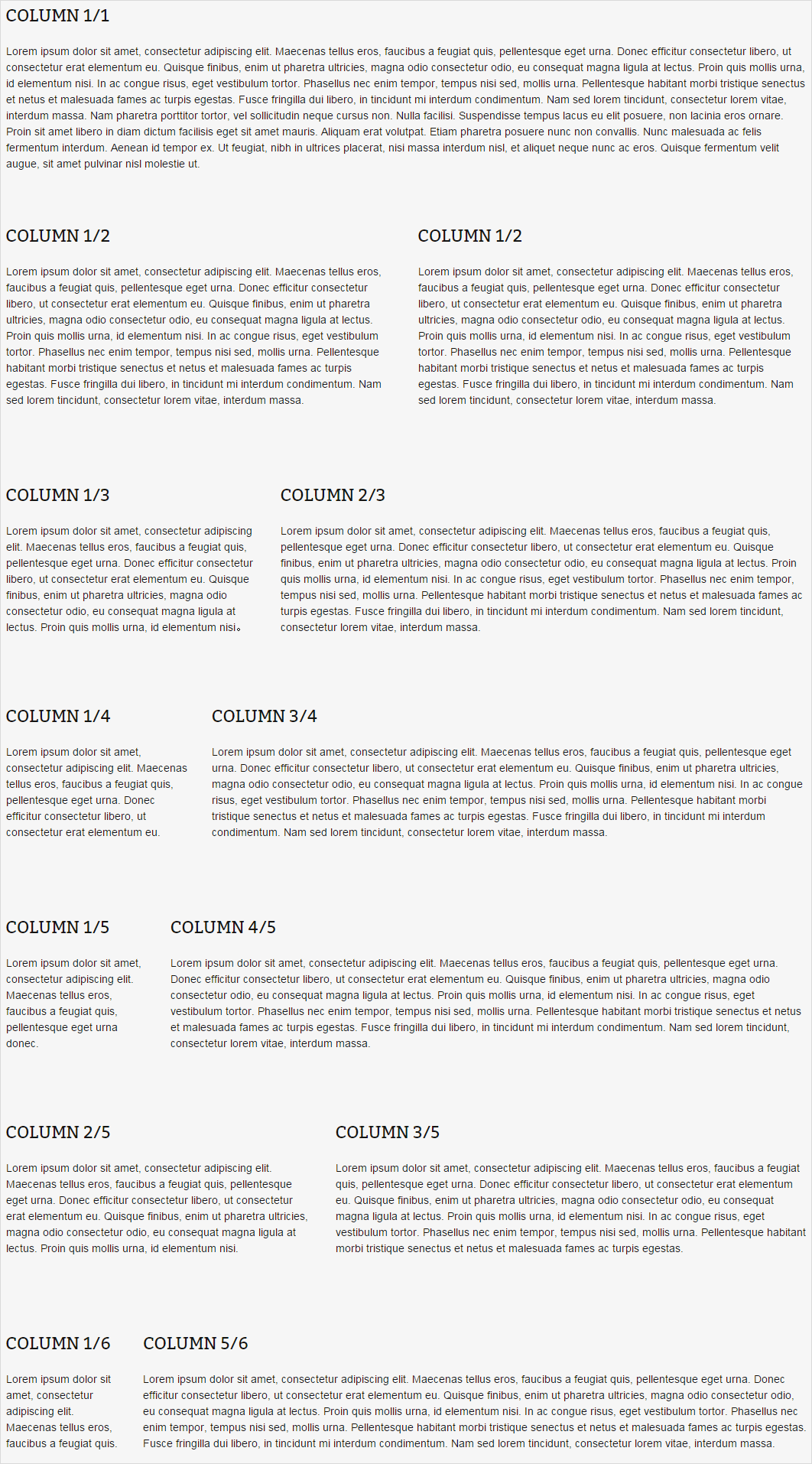
Columns are a way to style your post or page using two to six columns. Whether your trying to organize a team page or create a customized homepage there are many situations when you need to create columns within a wordpres page or post.With our column shortcodes it is possible to create any type of layout. The main thing to remember is when you are done with a row of columns then be sure to place a “_last” on the last column shortcode in the row.You also need to make sure that your columns will all fit within the page.
Columns Offers Column Sizes & Combinations From 1-6 Columns
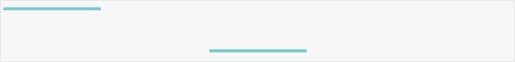
Divider Shortcode
You may have noticed in WordPress that it can be a challenge to have a hard return (or worse yet: a double hard return or extra paragraph break) when using the WYSIWYG editor. WordPress is trying to be “helpful” and remove accidental double hard returns for you. However, sometimes you want that extra space and it can be a little tricky to get it in there. A “divider” adds a good chunk of space between content blocks, you could use it when you’d like two paragraph returns. Our divider shortcode is perfect to use to break up content and draw the users eye to the next section. Each divider short code also has a spacer element included that allows you to adjust the spacing to obtain more or less around the divider.
10 Divider Styles
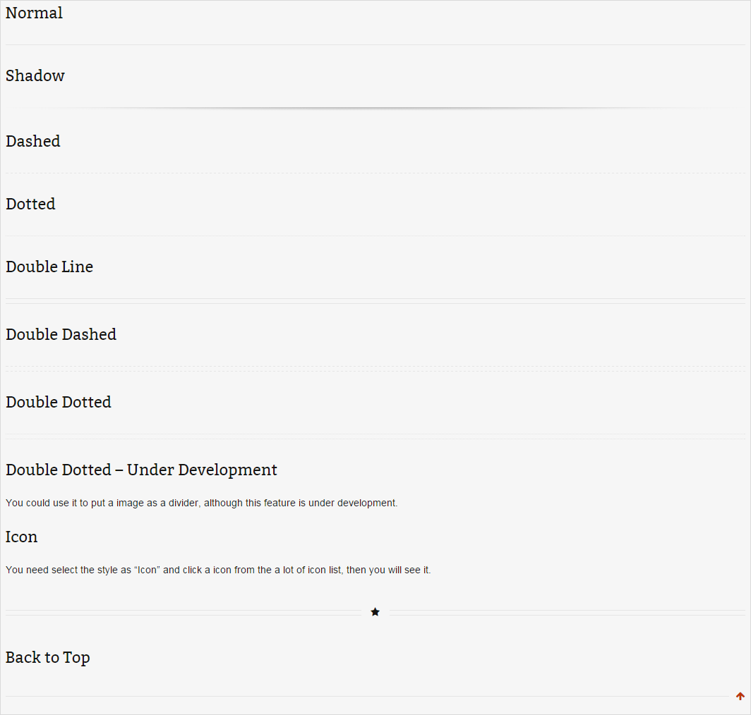
Custom Alignment
The alignment have the left and center, but not the right. This align feature only work on the Normal Style. Other styles are all align left no matter what you set.
Custom Width
You could set the divider width by pixels or percent, like 300px or 50%.
Custom Margin Top And Bottom
You could set the divider top margin or bottom nargin by pixels, like 0px, 25px, 50px.
Custom Border Size
Any bolder size in pixels you could set to the divider, like 3px, 10px, 20px.
Notice: Some styles maybe can’t change the boeder size, like shadow style.
Custom Color
There are unlimited border color you could use, but please notice there are some styles can only use the default color and can’t change, like icon style and shadow style.
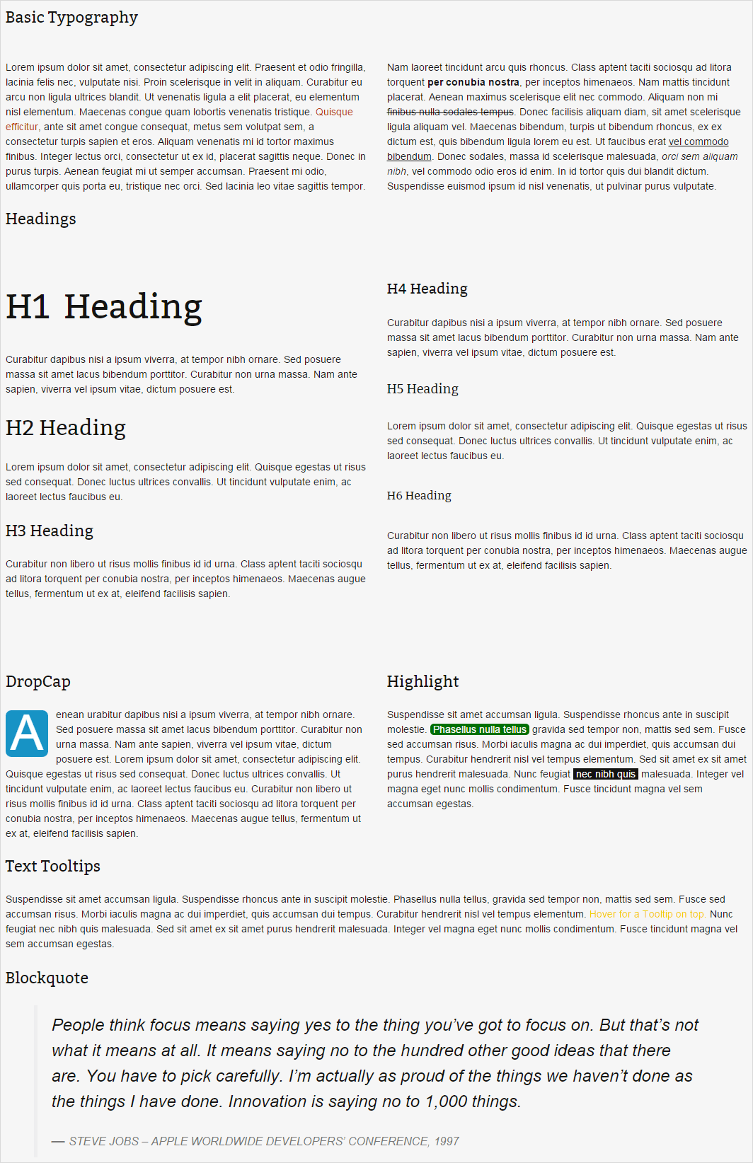
Dropcap Shortcode
What is Dropcap? See the features of Dropcap.”It is the first letter of a paragragh. It is much bigger than the other words of the paragragh. It drops down two or more lines of the text.” Dropcap is used for the first letter capitalized, it has unlimited colors.This is one of the most cutting edge features in all of WordPress development. Never before did people think you could capitalize and creatively style the first letter of the first word of a paragraph. With our shortcode, you can use the Dropcap without typing any code.
2 Styles
There are two styles you could set: boxed or no boxed. Boxed style could set the backgound color and the boxed radius, no boxed style couldn’t set the boxed radius but could set the text color.
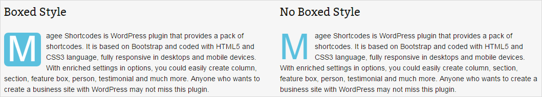
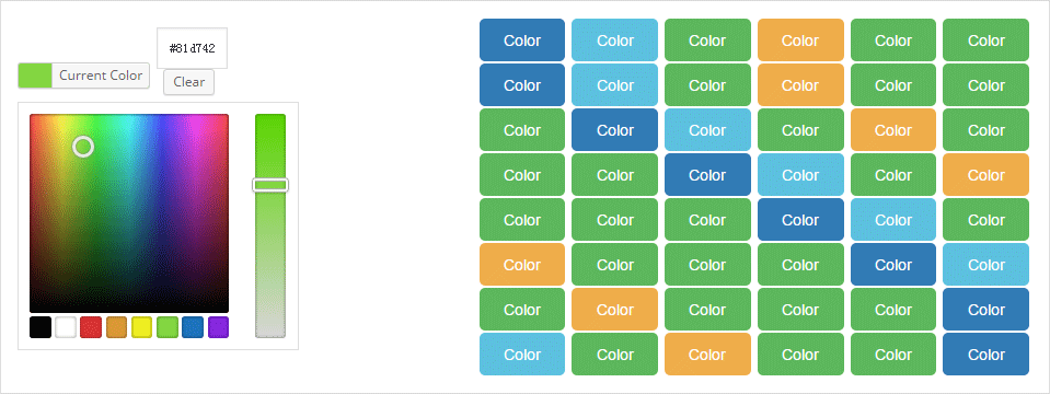
Unlimited Colors
Both styles you could set unlimited colors for them. The difference is boxed style you set is background color and no boxed style you set is text color.

Feature Box Shortcode
With the Feature Box Shortcode, you can present and explain the features and functions of your products clearly, thus it will make your product outstanding and highly attractive to buyers. Besides, you can use the Feature Box Shortcode to introduce your business scope etc. Feature Box Shortcode has powerful functions and it is easy to use. The only thing you need to do is to insert the shortcode Service to the Editor of the Themes. Use feature box you could introduce the features of your website with image, title and instruction like below.
4 Different Styles
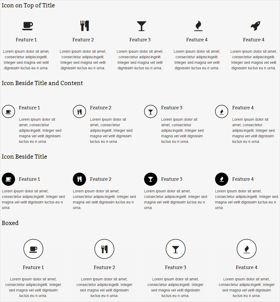
Various Color & Icon Animation
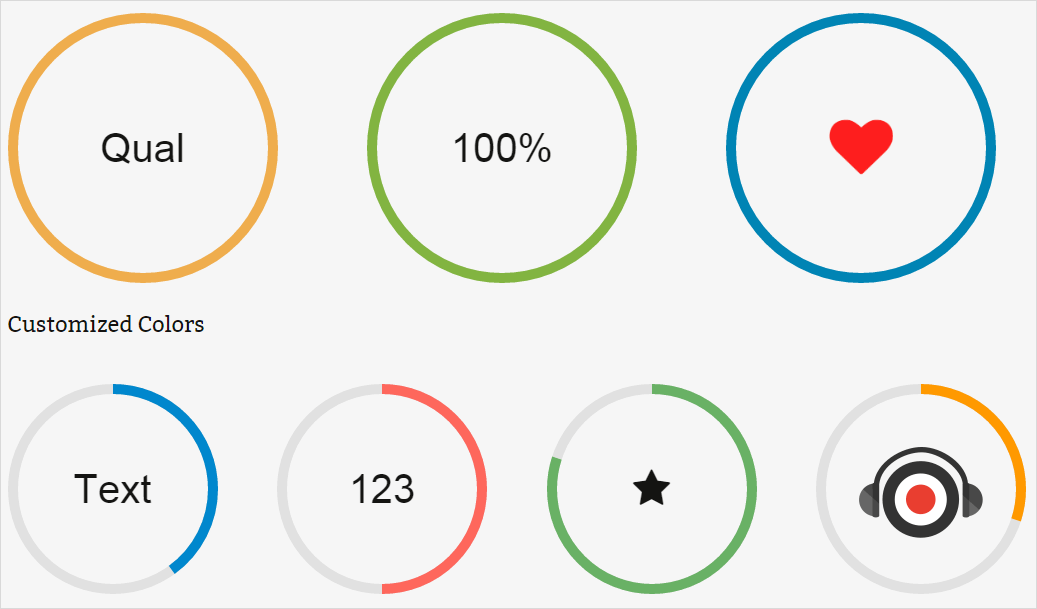
Piechart Shortcode
A piechart is a type of graph in which a circle is divided into sectors that each represent a proportion of the whole. The Piechart Shortcode is also described as “Carefully crafted elements come together into one amazing design.”
Here are the parameters of pie chart shortcode:
- Percent: should be a number from 0 – 100.
- Color: color of outer, tracking part, text and text background. You can choose any color from color palette. Default is the primary color.
- Title: chart title/name.
- Icon: an icon from the icon set.
- Text: the chart’s content.
- Thickness: the thickness of circle (in px).
- Speed: tracking speed. Numerical value only, 1000 = 1 second.
- Delay: The time delay before the animation run in millisecond unit.
- Size: Pie chart size, measured in px.
- Linecap: butt, square or round. Default is butt.
- ID: enter a unique ID for your step.
- Class: enter a unique class name for your step.
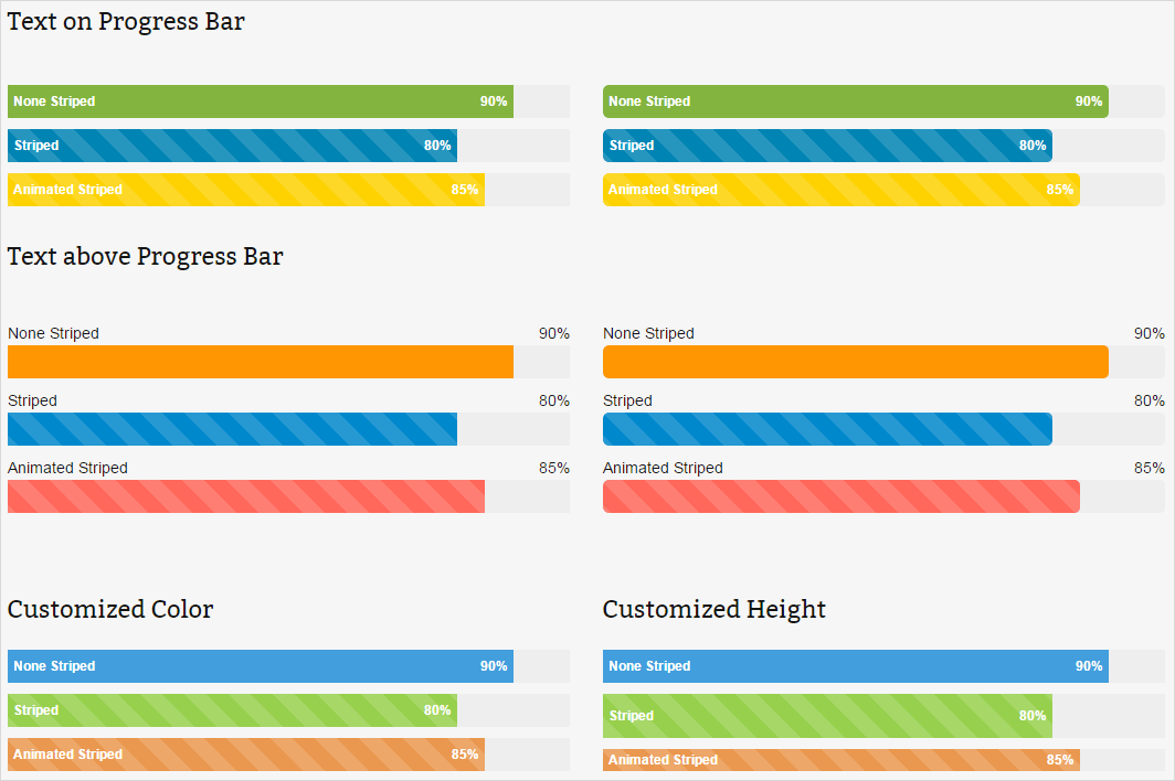
Progress Bar Shortcode
Progress bars are a component in a graphical user interface used to visualize the progression of an extended computer operation, such as a download, file transfer, or installation. Sometimes, the graphic is accompanied by a textual representation of the progress in a percent format. These are great for displaying varying types of data and content to your viewers. The progress bar include several options for easy customization and is a great way to visually attract the viewer and display content. You can also use Progress Bars shortcode to show some progresses.
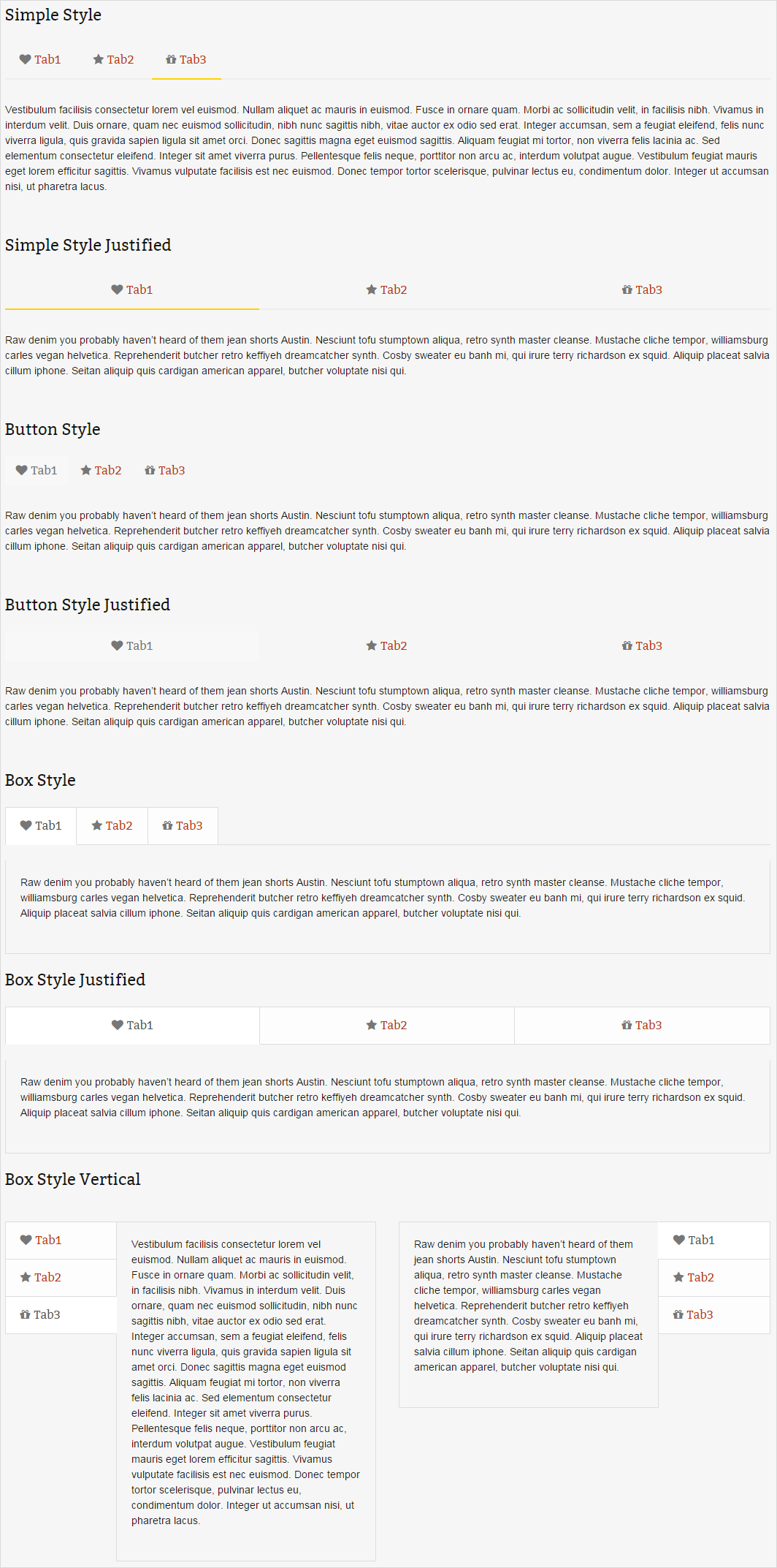
Tabs Shortcode
Tabs are a nice way to group related content. The reader will be able to flip through the pages by clicking on the relevant tab. Create Tabbed Content with the click of a button using the Tabs Shortcode. Tabs have a fluid width, which means that they can adjust to any page size. For the first time you can take advantage of tabs with dynamic contents. It means Tabs now can link up to the news section of your website and each tab will update itself once you add news to your website. Tabs are perfect for displaying a bunch of organized information in a small area. You can use any of the other shortcodes inside the tabs, insert images, icons, checklists and more, whatever you need to get your information to your viewer.
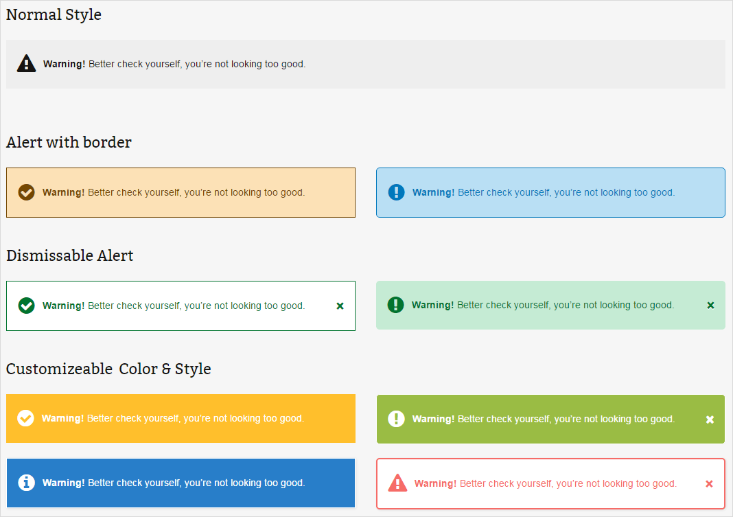
Alert Shortcode
Alerts are some elements that you can drop into a form or inline on a page to show information,success, warnings or error. The alert displays an alert box with a specified message and the alert box is often used if you want to make sure information comes through to the user.These are perfect for displaying important information, alerts or messages to your viewers. The options we include allow you to animate the box when it shows in the viewport, use font awesome icons, customize the colors, accent colors, border sizes and more.
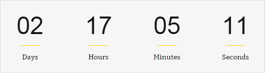
Countdown Shortcode
Countdown is an act of counting numerals in reverse order to zero, you could use this to time the last seconds before some special event. With the help of our Countdown shortcode you can choose a future date and it will start counting.
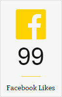
Counter Box Shortcode
The Counter Box Shortcode is a wonderfully simple, yet incredibly engaging element that can be used almost anywhere. It’s great for sharing statistics or tidbits of information about your company or service. The Counter Box Shortcode will not begin incrementing until it has come into the viewport of the screen so that you can see the effect take place. These are great for displaying varying types of data and content to your viewers. The counter boxes include several options for easy customization and is a great way to visually attract the viewer and display content.
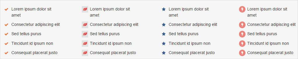
List Shortcode
List is a number of connected items or names written or printed consecutively, typically one below the other. With our List Shortcode, one can emphasize your lists with custom icons such as the often-needed, success, info, green plus, red minus, warning, star.
Panel Shortcode
The panel shortcode can be used to put content in a box on your WordPress website. Because of its many options, it can also be used as a general layout element for page building.

Person Shortcode
The person shortcode shows a person with a name, title, image, social networks, and a description. The person shortcode is perfect for showing your team members, clients, authors, guests, and more. Besides the information about the person, you can also set the border radius (rounded corners) of the image and add a shadow. The layouts for the person shortcode are templates that can be customized to suite your needs. There are several predefined templates with more to come. Our person shortcode is perfect for using to introduce all your team members or only a few. You can also show hierarchy by putting more prominent team members inside of large column shortcodes.

Promo Box Shortcode
Control the size, color, position, and link of a button within the promo box shortcode. The button is a great tool for a call-to-action. Take your product marketing to the next level with the Promo Box Shortcode! Easily add an image above by setting it in the shortcode, and then place whatever you want in here. Add in an engaging button to get your users to click through!
Social Icons Shortcode
Magee includes a large set of social icons to use throughout the theme and you can also upload a custom icon These icons are a vector font icon instead of an image, which produces much faster load times and will always ensure perfect sharpness. With the social icon, you can display links to your social profiles with clean and tidy icons (or use your own icon!). Social icons are loaded with options that allow you to easily cusotmize them. Choose boxed or unboxed, border radius, icon color globally or individually, box color globally or individually, hover tooltip position and more.
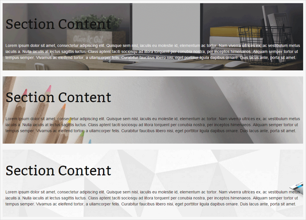
Section Shortcode
With section shortcode, users can divide the page into sections by positon setting, background customization, color diversification and so on.
Timeline Shortcode
Timeline is a graphic representation of the passage of time as a line. For example, you could use this to represent your site history. Use the timeline shortcode to create your own vertical list of events. You can also use the timeline layout in many of the post types. You can animate the event as it comes into view on scroll. There are a number of options to choose from when creating your list of events.

Testimonial Shortcode
Add testimonies to your WordPress posts and pages using the testimonies shortcode. Testimonies can be manually added or pulled from the Intense testimonials posts. Testimonies layouts are created using templates. Testimonies can be shown in a slider. Testimonials are the perfect way to show your potential clients the kind of work you can provide. It allows you to use individual testimonial boxes and has two styles like below.

Typography Shortcode
We have custom typography shortcodes that you can use on content to style it differently: text tooltips, headings, dropcaps, highlights, block quotes. With these options you can ensure that the typography on your site is stylized and looks sharp.
More Feature Detail
Due to the page limitation, we can't show each shortcode feature detail here, but you could see these in the demo site http://www.mageewp.com/magee-shortcodes-demo/ . You could refer them to set yourself shortcode.
Hello world!
Welcome to MageeWP Sites. This is your first post. Edit or delete it, then start blogging!
Markup: HTML Tags
Headings
Header one
Header two
Header three
Header four
Header five
Header six
Blockquotes
Single line blockquote:
Stay hungry. Stay foolish.
Multi line blockquote with a cite reference:
People think focus means saying yes to the thing you've got to focus on. But that's not what it means at all. It means saying no to the hundred other good ideas that there are. You have to pick carefully. I'm actually as proud of the things we haven't done as the things I have done. Innovation is saying no to 1,000 things.
Steve Jobs - Apple Worldwide Developers' Conference, 1997
Tables
| Employee | Salary | |
|---|---|---|
| John Doe | $1 | Because that's all Steve Jobs needed for a salary. |
| Jane Doe | $100K | For all the blogging she does. |
| Fred Bloggs | $100M | Pictures are worth a thousand words, right? So Jane x 1,000. |
| Jane Bloggs | $100B | With hair like that?! Enough said... |
Definition Lists
- Definition List Title
- Definition list division.
- Startup
- A startup company or startup is a company or temporary organization designed to search for a repeatable and scalable business model.
- #dowork
- Coined by Rob Dyrdek and his personal body guard Christopher "Big Black" Boykins, "Do Work" works as a self motivator, to motivating your friends.
- Do It Live
- I'll let Bill O'Reilly will explain this one.
Unordered Lists (Nested)
- List item one
- List item one
- List item one
- List item two
- List item three
- List item four
- List item two
- List item three
- List item four
- List item one
- List item two
- List item three
- List item four
Ordered List (Nested)
- List item one
- List item one
- List item one
- List item two
- List item three
- List item four
- List item two
- List item three
- List item four
- List item one
- List item two
- List item three
- List item four
HTML Tags
These supported tags come from the WordPress.com code FAQ.
Address Tag
1 Infinite LoopCupertino, CA 95014
United States
Anchor Tag (aka. Link)
This is an example of a link.
Abbreviation Tag
The abbreviation srsly stands for "seriously".
Acronym Tag (deprecated in HTML5)
The acronym ftw stands for "for the win".
Big Tag (deprecated in HTML5)
These tests are a big deal, but this tag is no longer supported in HTML5.
Cite Tag
"Code is poetry." --Automattic
Code Tag
You will learn later on in these tests that word-wrap: break-word; will be your best friend.
Delete Tag
This tag will let you strikeout text, but this tag is no longer supported in HTML5 (use the <strike> instead).
Emphasize Tag
The emphasize tag should italicize text.
Insert Tag
This tag should denote inserted text.
Keyboard Tag
This scarcely known tag emulates keyboard text, which is usually styled like the <code> tag.
Preformatted Tag
This tag styles large blocks of code.
.post-title {
	margin: 0 0 5px;
	font-weight: bold;
	font-size: 38px;
	line-height: 1.2;
	and here's a line of some really, really, really, really long text, just to see how the PRE tag handles it and to find out how it overflows;
}
Quote Tag
Developers, developers, developers...
--Steve Ballmer
Strike Tag (deprecated in HTML5)
This tag shows strike-through text
Strong Tag
This tag shows bold text.
Subscript Tag
Getting our science styling on with H2O, which should push the "2" down.
Superscript Tag
Still sticking with science and Isaac Newton's E = MC2, which should lift the 2 up.
Teletype Tag (deprecated in HTML5)
This rarely used tag emulates teletype text, which is usually styled like the <code> tag.
Variable Tag
This allows you to denote variables.
Markup: Image Alignment
Welcome to image alignment! The best way to demonstrate the ebb and flow of the various image positioning options is to nestle them snuggly among an ocean of words. Grab a paddle and let's get started.
On the topic of alignment, it should be noted that users can choose from the options of None, Left, Right, and Center. In addition, they also get the options of Thumbnail, Medium, Large & Fullsize.

The image above happens to be centered.
 The rest of this paragraph is filler for the sake of seeing the text wrap around the 150x150 image, which is left aligned.
As you can see the should be some space above, below, and to the right of the image. The text should not be creeping on the image. Creeping is just not right. Images need breathing room too. Let them speak like you words. Let them do their jobs without any hassle from the text. In about one more sentence here, we'll see that the text moves from the right of the image down below the image in seamless transition. Again, letting the do it's thang. Mission accomplished!
And now for a massively large image. It also has no alignment.

The image above, though 1200px wide, should not overflow the content area. It should remain contained with no visible disruption to the flow of content.

And now we're going to shift things to the right align. Again, there should be plenty of room above, below, and to the left of the image. Just look at him there... Hey guy! Way to rock that right side. I don't care what the left aligned image says, you look great. Don't let anyone else tell you differently.
In just a bit here, you should see the text start to wrap below the right aligned image and settle in nicely. There should still be plenty of room and everything should be sitting pretty. Yeah... Just like that. It never felt so good to be right.
And just when you thought we were done, we're going to do them all over again with captions!
The image above happens to be centered. The caption also has a link in it, just to see if it does anything funky.
The rest of this paragraph is filler for the sake of seeing the text wrap around the 150x150 image, which is left aligned.
As you can see the should be some space above, below, and to the right of the image. The text should not be creeping on the image. Creeping is just not right. Images need breathing room too. Let them speak like you words. Let them do their jobs without any hassle from the text. In about one more sentence here, we'll see that the text moves from the right of the image down below the image in seamless transition. Again, letting the do it's thang. Mission accomplished!
And now for a massively large image. It also has no alignment.
The image above, though 1200px wide, should not overflow the content area. It should remain contained with no visible disruption to the flow of content.
And now we're going to shift things to the right align. Again, there should be plenty of room above, below, and to the left of the image. Just look at him there... Hey guy! Way to rock that right side. I don't care what the left aligned image says, you look great. Don't let anyone else tell you differently.
In just a bit here, you should see the text start to wrap below the right aligned image and settle in nicely. There should still be plenty of room and everything should be sitting pretty. Yeah... Just like that. It never felt so good to be right.
And that's a wrap, yo! You survived the tumultuous waters of alignment. Image alignment achievement unlocked!
Markup: Text Alignment
Default
This is a paragraph. It should not have any alignment of any kind. It should just flow like you would normally expect. Nothing fancy. Just straight up text, free flowing, with love. Completely neutral and not picking a side or sitting on the fence. It just is. It just freaking is. It likes where it is. It does not feel compelled to pick a side. Leave him be. It will just be better that way. Trust me.
Left Align
This is a paragraph. It is left aligned. Because of this, it is a bit more liberal in it's views. It's favorite color is green. Left align tends to be more eco-friendly, but it provides no concrete evidence that it really is. Even though it likes share the wealth evenly, it leaves the equal distribution up to justified alignment.
Center Align
This is a paragraph. It is center aligned. Center is, but nature, a fence sitter. A flip flopper. It has a difficult time making up its mind. It wants to pick a side. Really, it does. It has the best intentions, but it tends to complicate matters more than help. The best you can do is try to win it over and hope for the best. I hear center align does take bribes.
Right Align
This is a paragraph. It is right aligned. It is a bit more conservative in it's views. It's prefers to not be told what to do or how to do it. Right align totally owns a slew of guns and loves to head to the range for some practice. Which is cool and all. I mean, it's a pretty good shot from at least four or five football fields away. Dead on. So boss.
Justify Align
This is a paragraph. It is justify aligned. It gets really mad when people associate it with Justin Timberlake. Typically, justified is pretty straight laced. It likes everything to be in it's place and not all cattywampus like the rest of the aligns. I am not saying that makes it better than the rest of the aligns, but it does tend to put off more of an elitist attitude.
Markup: Title With Special Characters
Putting special characters in the title should have no adverse effect on the layout or functionality.
Special characters in the post title have been known to cause issues with JavaScript when it is minified, especially in the admin when editing the post itself (ie. issues with metaboxes, media upload, etc.).
Latin Character Tests
This is a test to see if the fonts used in this theme support basic Latin characters.
| ! | " | # | $ | % | & | ' | ( | ) | * |
| + | , | - | . | / | 0 | 1 | 2 | 3 | 4 |
| 5 | 6 | 7 | 8 | 9 | : | ; | > | = | < |
| ? | @ | A | B | C | D | E | F | G | H |
| I | J | K | L | M | N | O | P | Q | R |
| S | T | U | V | W | X | Y | Z | [ | |
| ] | ^ | _ | ` | a | b | c | d | e | f |
| g | h | i | j | k | l | m | n | o | p |
| q | r | s | t | u | v | w | x | y | z |
| { | | | } | ~ |
Markup: Title With Markup
Verify that:
- The post title renders the word "with" in italics and the word "markup" in bold.
- The post title markup should be removed from the browser window / tab.
Template: Featured Image (Vertical)
This post should display a featured image, if the theme supports it.
Non-square images can provide some unique styling issues.
This post tests a vertical featured image.